# 来源 https://www.r2omics.cn/
#加载包
library(tidyverse)
#创建数据集
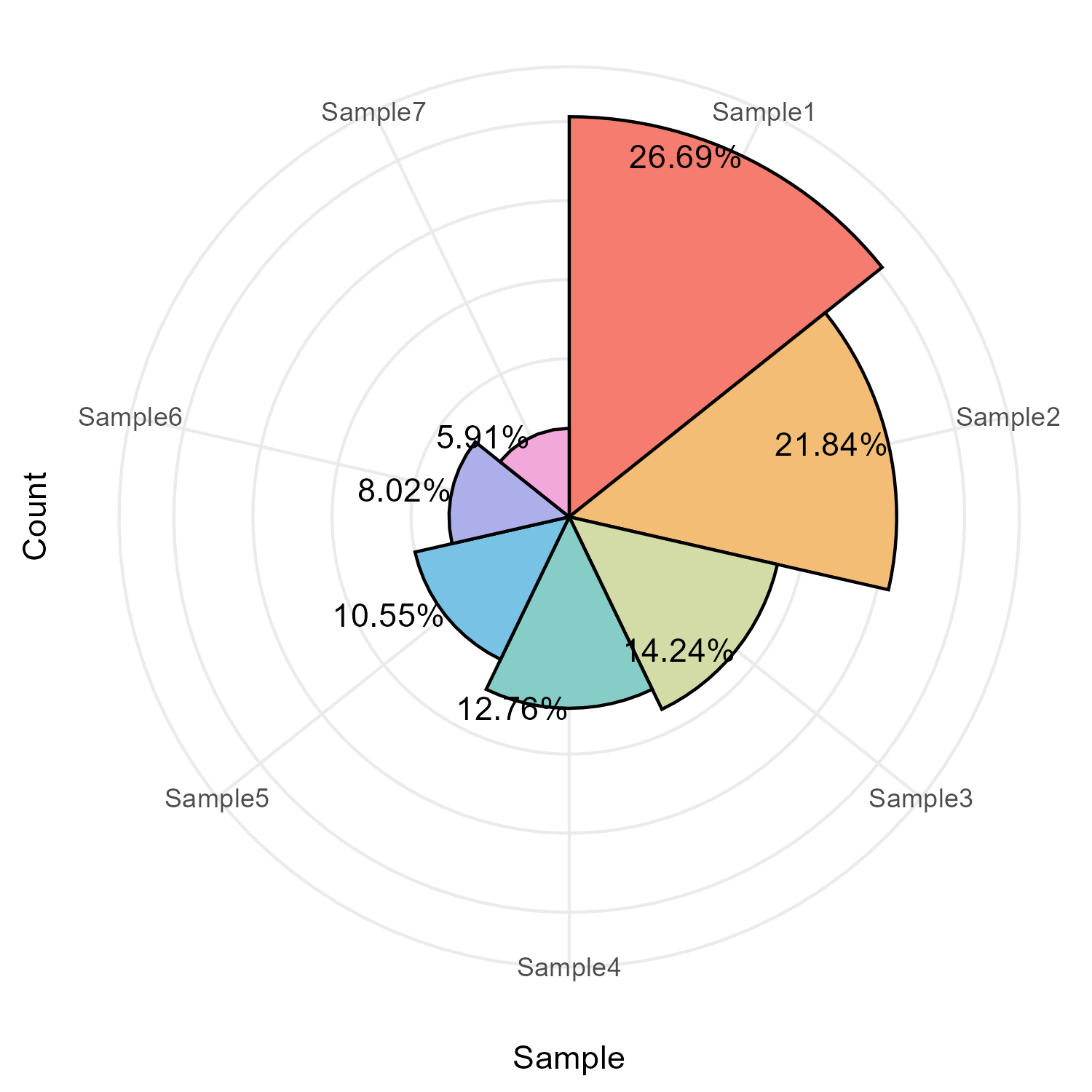
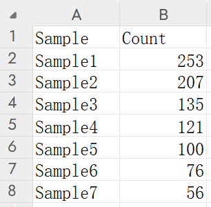
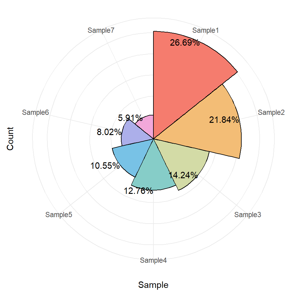
df = read.delim("https://www.r2omics.cn//res/demodata/rose.txt",check.names = F)
dfPlot = df %>%
mutate(Percent = paste0(round(Count/sum(Count)*100,2),"%") ) # 计算各样本占总数的百分比
# 使用ggplot2创建玫瑰图
ggplot(dfPlot, aes(x = Sample, y = Count, fill = Sample)) + # 设置x轴为样本类型,y轴为数量,填充颜色按样本类型区分
geom_bar(width = 1, color = 'black', stat = 'identity') + # 绘制柱状图,宽度为1,边框为黑色
coord_polar(theta = 'x') + # 将直角坐标系转换为极坐标系,形成饼图效果
geom_text(aes(label = Percent),hjust = 1) + # 添加百分比标签
ggstyle::scale_fill_sci(palette="rainbow1")+ # 设置颜色,采用ggstyle包中的彩虹色
theme_bw() +
theme(
panel.border = element_blank(), # 移除图表边框
axis.text.y = element_blank(), # 移除y轴刻度标签
axis.ticks.y = element_blank(), # 移除y轴刻度线
legend.position = 'none' # 不显示图例
)