# 代码来源:https://www.r2omics.cn/
# 加载R包,没有安装请先安装 install.packages("包名")
library(plot3D)
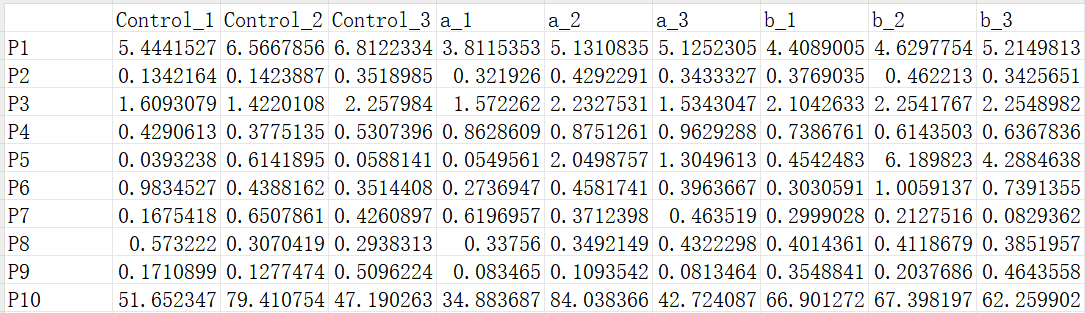
# 读取PCA数据文件
df = read.delim("https://www.r2omics.cn/res/demodata/PCA/data.txt",# 这里读取了网络上的demo数据,将此处换成你自己电脑里的文件
header = T, # 指定第一行是列名
row.names = 1 # 指定第一列是行名
)
df=t(df) # 对数据进行转置,如果想对基因分组则不用转置
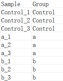
# 读取样本分组数据文件
dfGroup = read.delim("https://www.r2omics.cn/res/demodata/PCA/sample.class.txt",
header = T,
row.names = 1
)
# PCA计算
pca_result <- prcomp(df,
scale=T # 一个逻辑值,指示在进行分析之前是否应该将变量缩放到具有单位方差
)
pca_result$x<-data.frame(pca_result$x)
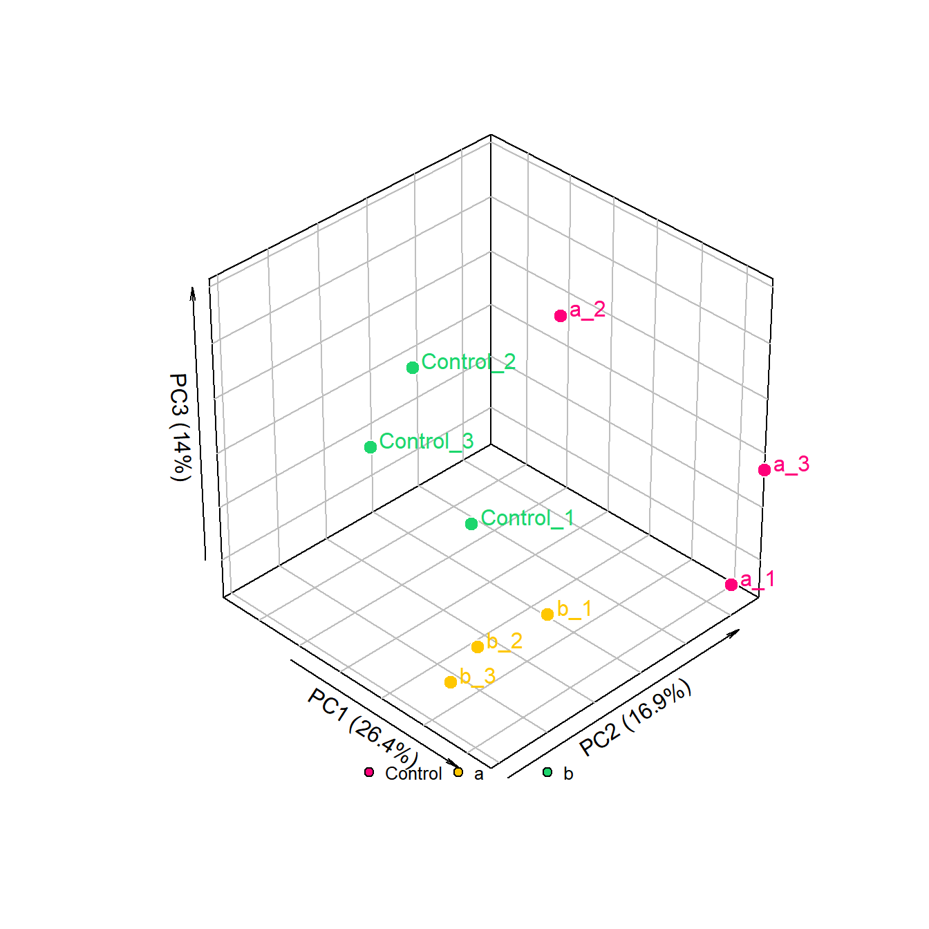
# 设置颜色,有几个分组就写几个颜色
colors <- c("#ff007a","#ffc700","#1dd66d")
myColors <- colors[as.numeric(as.factor(dfGroup[,1]))]
# 计算PC值,用来替换坐标轴上的标签
pVar <- pca_result$sdev^2/sum(pca_result$sdev^2)
pVar = round(pVar,digits = 3)
xName = paste0("PC1 (",as.character(pVar[1] * 100 ),"%)")
yName = paste0("PC2 (",as.character(pVar[2] * 100 ),"%)")
zName = paste0("PC3 (",as.character(pVar[3] * 100 ),"%)")
# 绘图
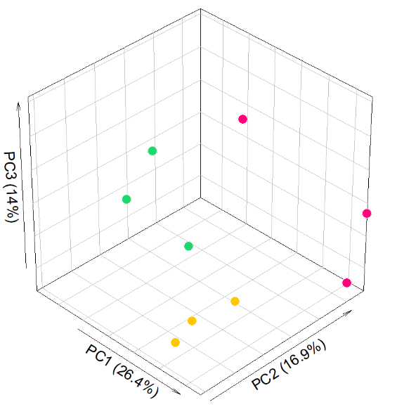
with(data.frame(pca_result$x[,1:3]), plot3D::scatter3D(
x = PC1, # 根据数据里的列名,设置X轴映射
y = PC2,
z = PC3,
pch = 21, # 设置散点的形状为实心圆
cex = 1.5, # 设置散点的大小
col=NA,
bg=myColors, # 设置散点的背景色
xlab = xName, # 设置 x 轴标签
ylab = yName,
zlab = zName,
ticktype = "simple", # 设置刻度线类型,还有detailed选项
bty = "b2", # 设置主题 b
box = T, # 显示坐标轴盒子
theta = 45, # 设置旋转角度
phi = 35, # 设置视角角度
d=10,
colkey = F # 不显示颜色键
))
# 标签
legend("bottom", # 指定图例位置在底部
title = "", # 设置图例标题为空
legend = unique(dfGroup$Group), # 使用数据框 dfGroup 中的组别进行标记
pch = 21, # 设置图例标记的形状为实心圆
pt.cex = 1, # 设置图例标记的大小
cex = 0.8, # 设置图例文本的大小
pt.bg = colors, # 设置图例标记的背景色
bg = "white", # 设置图例的背景色
bty = "n", # 去除图例的边框
horiz = TRUE # 设置图例水平显示
)
# 添加散点的文字标注
with(data.frame(pca_result$x[,1:3])+1, # 在原来的数据上+1设置一个偏移量
plot3D::text3D(
x = PC1, # 根据数据里的列名,设置X轴映射
y = PC2,
z = PC3,
colkey = FALSE,
add = TRUE,
labels = row.names(pca_result$x),
col = myColors))